

Color has long been recognized by artists and interior designers as a powerful influence on mood, emotion, and perception. As Pablo Picasso once said, “Colors, like features, follow the changes of the emotions.” More than just visual elements, colors serve as a communication tool, signaling action, setting the tone of a space, and even triggering physiological responses such as increased heart rate or eyestrain.
Color plays a key role not only in how we feel but also in how we make decisions, from the products we buy to the clothes we wear and how we design our living spaces. When used thoughtfully in home renovation, bold colors can make striking statements and transform ordinary rooms into expressive, vibrant environments. In this article, we’ll explore practical tips for using bold colors in home renovation projects to bring personality and energy.
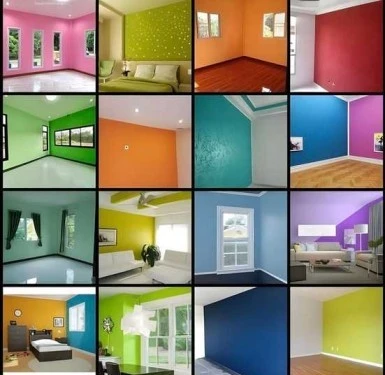
Why Use Bold Colors in Home Renovation?
Using bold colors in your home renovation isn’t just about making a statement; it’s about creating an environment that reflects your personality. Bold hues can:
- Enhance mood and energy.
- Create a memorable, custom look.
- Highlight architectural details or key design features.
- Add depth and contrast to neutral spaces.
When applied with intention, bold colors in home renovation can elevate your interior design to a whole new level. The following tips will guide you on how to use bold colors:
1. Choose a Focal Point
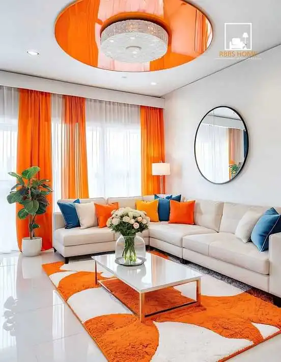
Start small. Rather than splashing bold color across every surface, pick one area to highlight. This could be: An accent wall. A colorful kitchen island or cabinet. A sofa or armchair in a rich jewel tone. A bold backsplash or tile pattern. Focusing on one bold element ensures impact without overwhelming the room.
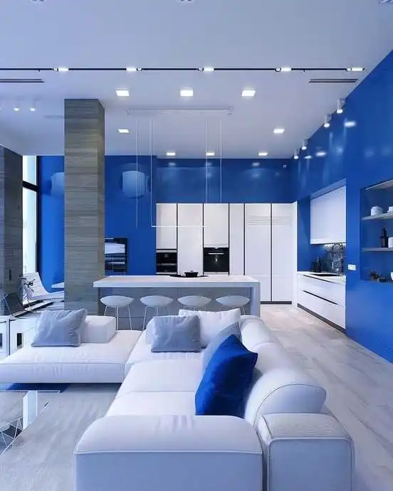
2. Balance with Neutrals
To keep bold colors from overpowering your space, pair them with neutral tones like: White, Gray, Beige, Natural wood finishes. For example, navy blue cabinets look sophisticated against white walls and wood accents. This balance helps maintain visual calm while allowing the bold color to stand out.
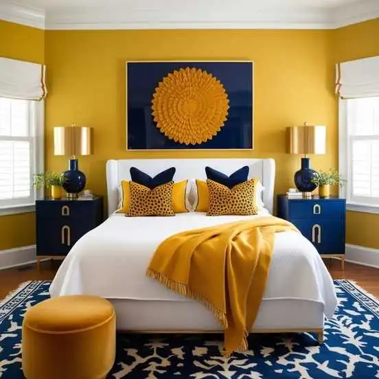
3. Use Color Theory to Guide Pairings
Understanding how colors work together is key to successful design. Complementary colors, those opposite each other on the color wheel, like blue and orange, create a vibrant contrast that adds energy and excitement to a space. On the other hand, analogous colors, such as teal and green, sit next to each other on the wheel and offer a more harmonious and soothing look.
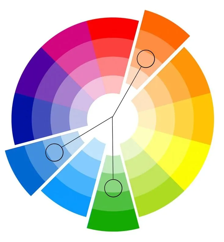
Choosing between warm tones like red, orange, and yellow, which energize a room, and cool tones like blue, green, and purple, which create a calming effect, allows you to shape the mood of your space intentionally. If you plan to use multiple bold colors in one space, make sure they have a similar saturation level. By applying these principles of color harmony, you can avoid clashing combinations and create a cohesive, well-balanced design.
4. Play with Texture and Finish
Incorporating different materials and finishes can make bold colors more interesting and sophisticated. Matte finishes offer a modern, muted look that tones down bright hues, while glossy surfaces reflect light, adding brightness and dimension to a space. Velvet furniture in deep tones brings a sense of richness and comfort, creating a cozy yet elegant atmosphere. Additionally, bold wallpapers with texture can transform even small spaces into luxurious retreats. This layered approach not only enhances visual interest but also softens the intensity of bold shades, resulting in a more balanced and inviting design.
5. Test Before You Commit
Before painting an entire room: Use samples on the wall, view them at different times of the day, and pair them with your flooring, furniture, and lighting. This helps you see how the bold color interacts with your space and prevents expensive mistakes.
Conclusion
Using bold colors in home renovation can be both exciting and transformative. Whether you’re revamping a single room or remodeling an entire home, bold hues can set the tone and reflect your unique style. By starting small, balancing with neutrals, and using color theory, you can confidently embrace bold color without compromising elegance or comfort.